Showing posts with label Colour. Show all posts

Friday, January 26, 2024

Welcome to 2024 ....

Hi everyone ...


It's here; another year.  I always do a post on the Pantone colour of the year and Trends for the year.  Every paint company selects their own colour of the year which has nothing to do with the Pantone colour.  This year Pantone has selected "Peach Fuzz" a warm and cozy hue. Well it certainly has the feeling of spring which we are waiting for.

Here are some images of how we will see it this year.


Thursday, January 26, 2023

PANTONE COLOUR OF THE YEAR 2023

Welcome to 2023!

I have been a  little behind in posting this past few months but I am back in the saddle as the saying goes. Unfortunately my computer is still on a break, however I believe it is back now.

Every year the Colour Marketing Board announce what they deem to be the colour of the year.

All the large paint companies also offer the colour of the year from their palettes.  This year the CMB has selected Viva Magenta.18-1750.  They describe it to have vim and vigor.  It comes from the red family which expresses strength. It is bold, brave and fearless and promotes optimism  It connects to nature which is a theme throughout the design industry as well as all other areas such as graphics and design, fashion, beauty, home furnishings and accessories.

I have to say it is a very uplifting and cheerful colour which we can enjoy after the past few Covid years.

Below are a few bright photos which certainly are alive and fun. 


My next few posts will be about the 2023 Trends to look forward to.

Friday, February 25, 2022

2022 colour of the year

 As always the Colour Marketing Group Have named the colour that will be seen in 2022.

ANNOUNCING THE PANTONE COLOR OF THE YEAR 2022

PANTONE 17-3938 Very Peri

“The Pantone Color of the Year reflects what is taking place in our global culture, expressing what people are looking for that color can hope to answer.” added Laurie Pressman, Vice President of the Pantone Color Institute. “Creating a new color for the first time in the history of our Pantone Color of the Year educational color program reflects the global innovation and transformation taking place. As society continues to recognize color as a critical form of communication, and a way to express and affect ideas and emotions and engage and connect, the complexity of this new red violet infused blue hue highlights the expansive possibilities that lay before us”.

Encompassing the qualities of the blues, yet at the same time possessing a violet-red undertone, PANTONE 17-3938 Very Peri displays a spritely, joyous attitude and dynamic presence that encourages courageous creativity and imaginative expression.

At this time of year every well known paint company selects their own personal colour of the year.

This is exactly what we need - a little joy after the past two years of covid19 and to help our spirits as we move through this year.


Tuesday, January 19, 2021

The Colour of the Year 2021 as determined by the Colour Marketing Group

Each year we are informed of what the colour of the year will be by the Colour Marketing Group.  This year there are two  Pantonne Colours  -Ultimate Gray and Illuminating a bright yellow 

A not-for-profit, international association of color design professionals, Color Marketing Group ® is a forum for the exchange of all things color. Members represent a broad spectrum of designers, marketers, color scientists, consultants, educators, and artists.


It is said that the Pantonne Colours of 2021 are a marriage of color conveying a message of strength and hopefulness that is both enduring and uplifting.  A dynamic duo. Perfect for this coming year. They are two independent colors that highlight how different elements come together to support one another,


Tuesday, October 20, 2020

MORE BROWSING FOR HOME DECOR

As a continuation of my trips to retail stores that specialize in furniture and home decor I dropped into Structube for a little look and found many great items.  It will not disappoint. Below are a few looks you might like.  Gray is still popular but there is a lot of cognac hues throughout.


                                              Benches are very popular for a casual look


Tuesday, October 13, 2020

STILL CHECKING OUT HOME FURNISHINGS AND DECOR STORES

Well I have to share some of the fantastic items at Kitchen Stuff Plus (KSP) which a lot of people know about.  They have a wide array of kitchen/dining products from everyday to party.  They also have bath products and so many little gadgets you will go crazy wandering through this great store.  I am attaching some photos below of the kitchen/dining products in this post. I will share the other products in a future post. They carry high end end pieces like Staub Cookware, Henckels &  Zwilling Knives at great price points. You can even purchase dining tables and chairs, a lovely bar with storage and all the linens you would need. I could go on about the many fabulous products but you really should take some time to visit this store at one of their many locations.


Monday, January 11, 2016

Colour - Go for it!

“Colour is like food for the spirit – plus it’s not addictive or fattening” says Isaac Muzrahi


2016 color trends bring an abundance of variety to suit everyone, even the diehard 
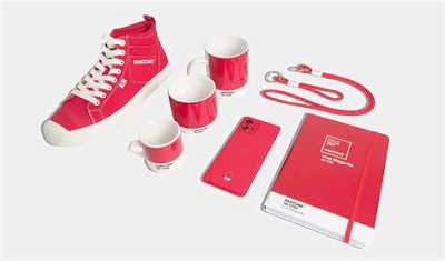
neutral lovers.  Our Colour of the Year is actually two colours - Rose Quartz and Serenity which are soft pink and blue.   In looking forward to spring we think in color, so it only makes sense to add some of that refreshing color to our homes.  Colour trends in 
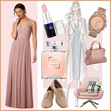
interior décor tend to follow those of fashion runways and this spring/summer is no exception with both fashion and decor very colorful.
Colour is a fundamental and important design element.  When used properly, color provides cohesion of design, and, color themes can evoke different moods or a tone to a room.

Linking rooms enhances any space. If rooms have good color transition and correlation, they have a smooth & harmonious flow. It is essential to create a flow in a house with an open floor plan or one in which rooms connect through wide openings, by choosing colors that relate to each other in a pleasing way. The challenge is to give each space its own identity according to its function and still achieve a feeling of unity. The connection can be as subtle as a recurring color in the fabrics, accessories and furniture in each room, transitioned with wall colors that are closely related and similar in value and intensity. Using unrelated colours in adjoining rooms can make the house feel like a disjointed series of spaces, while colours that relate to each other draw the eye from one room to the next and create that pleasing flow.

Colour affects our emotions and the effective balance of color will provide a harmonious setting, which in turn creates a pleasant “feeling” in the space. Decide on how you want to “feel” in the room - calm or energized, intimate or open, dramatic or playful; the use of different color will promote this “feeling or mood”.  It is also important to look at another factor when selecting colour.
                                                                                                                                    
Lighting is one of the most crucial elements when selecting color.  The room’s exposure; type of light – direct sunlight, indirect sunlight or artificial light; and time of day you will most likely use the room; play a part in your decisions.  Since colour changes when viewed under different light sources, paint and accessories should be viewed in the actual space and lighting where they will be used.

The use of color is the easiest way to transform a room.  This can be done with paint, wallpaper, tiles, fabric, flooring, art & accessories.  Paint is one of the least expensive ways to transform a space. Though more costly, wallpaper has made a large comeback this season, with contemporary, simple patters and graphics.  Colourful accessories can add impact and freshen up a room without breaking the bank. When a space requires a sprucing up, color, no matter where applied, can make the largest impact.

The use of color does not mean you cannot have a neutral pallet. Adding a dash of color to the already neutral palette gives the room a new look and this color dash can be removed at any time.   Keeping large items such as sofas, chairs and draperies neutral and enhancing with colored toss cushions, accessories, lamps, art, etc. adds style to your space.  These small items can be changed by season, or as you tire of them, without great expense.

One of the first things most interior designers will tell you when it comes to color is to determine the paint for your walls AFTER you have selected the more expensive pieces in the room. The reason is simple, always match the paint to the furniture. Paint is one of the least-expensive decorating elements in a room and can be easily altered and changed as needed.  There are more colors available in paint than any other medium available. 

The best way to establish a color palette for your home is to have a starting point or inspiration piece, a painting, carpet, pottery chair, from which to draw out the color. Look for a pattern that appeals to you. Use that inspirational piece and break it down in terms of color “priority" to create your scheme.  Ultimately, select in the color family that appeals the greatest to you, while keeping in mind all the other factors involved – mood, lighting, theme - when making this selection.  Most Important – Have Fun!


Monday, January 4, 2016

Pantonne Colour of the Year 2016


It's that time of year again when the Pantonne Colour of the Year is introduced.by the Colour Marketing Group. www.colormarketing.org/  This year, a softer take on color for 2016: For the first time, the blending of two shades – Rose Quartz and Serenity are chosen as the PANTONE Color of the Year


Rose Quartz and Serenity demonstrate a balance - the warmer Rose Quartz and the cooler Serenity for a soothing look  I like these colours as they envoke a feeling of spring and are easier to live with than some of the previous Colours of the year..


Tuesday, May 12, 2015

Inspiration: 7 Kitchens with Bold Backsplashes

A guest post by Jane Blanchard -

Inspiration: 7 Kitchens with Bold Backsplashes

There's definitely one room that is of the utmost importance bringing the family together. It's the kitchen, and it's far more capable of producing more than just goods and aromas that are pleasing to the senses. If you're thinking of sprucing up your outdated kitchen, amazing backsplashes can do the job. Let's take a creative cue from those who brought in some color, sass, and spice to the mix!


Can you say “nautical” in a country accent? We love the nautical decor that really matches the backsplash tiles. The sea-breeze blue is light enough to compliment the white cabinets as well as being able to pass off on a country theme. You have the wood paneling above the range, the dark-stained wood counter-top, and all that's needed is a nice, deep farmhouse sink.


 This kitchen is the epitome of elegance. The tile colors have been chosen for a safe and neutral tone, while still adding character to fit the contemporary style. Two thumbs up for taste and cultivated beauty.


We are totally digging how this backsplash adds depth and space to this tiny kitchen area. Even a small backsplash can speak volumes. Tip for the fearless: go bold with rich colors to add more “pop” to the small area.


A delectable, modern twist on a 60's color palette. Everything goes together just beautifully; from the sleek, chocolate back-splash and glass chandelier, to the straight metallic hardware and retro bar stools. It looks as tasty as a chocolate covered banana!


 Big high fives on pulling off a futuristic look with the embedded lighting in the white cabinets that makes the blue really glimmer and shine. It's boldness enhances the white walls and white flooring. Just don't let the kids and pets inside the house ever again, unless... 

 via Modernize
 ...you have a more distinctive pattern like this to mask sticky fingers and cooking backsplash. We are on board with the small glass tiles that map out a sort of mosaic pattern that goes from the countertop to the ceiling. This creates depth in the pattern and elongates the cabinets, making the room seem taller than it really is.

 This kitchen has an Asian influence that's integrated with a modern plum color palette. We love the trendy style with a little floral that doesn't overwhelm the room. It's like a scrapbook page come to life!

The bottom line is: backsplashes can add a vivacious va-va-voom to a room. A little tile, a little shine, and a little color may be all you need.


For more design ideas and inspiration, head to Modernize.com.